Mastering Color Theory: How to Use Colors Like a Pro
Here we would dive into the essentials of color theory, helping artists and designers understand color relationships and harmonies. This guide offers practical tips for creating vibrant compositions and explores the psychological effects of color, empowering you to make informed choices in your artwork. Perfect for beginners and seasoned creatives alike!
10/16/20243 min read


Color is one of the most powerful tools in an artist's or designer's toolkit. It can evoke emotions, create depth, and set the tone for a piece. Understanding color theory is essential for mastering the use of color in your artwork. This article will explore the fundamentals of color theory, including the color wheel, color harmonies, and the psychological impact of colors, providing you with the knowledge to use colors like a pro.
The Color Wheel
At the heart of color theory is the color wheel, a visual representation of colors arranged according to their chromatic relationships. The color wheel is typically divided into three categories:
Primary Colors: Red, blue, and yellow are the primary colors. They cannot be created by mixing other colors and serve as the foundation for all other colors.
Secondary Colors: These are created by mixing equal parts of two primary colors. The secondary colors are green (blue + yellow), orange (red + yellow), and purple (red + blue).
Tertiary Colors: These colors are formed by mixing a primary color with a secondary color. Examples include red-orange, yellow-green, and blue-purple.
Understanding the color wheel helps artists and designers see how colors relate to each other, allowing for more informed choices when selecting palettes.
Color Harmonies
Color harmony refers to the way colors interact with each other. Creating a harmonious color palette is essential for achieving balance and visual appeal in your work. Here are some common color harmonies:
Complementary Colors: These are colors that are opposite each other on the color wheel, such as red and green or blue and orange. Using complementary colors creates a vibrant contrast, making each color stand out.
Analogous Colors: These colors sit next to each other on the color wheel, like blue, blue-green, and green. Analogous color schemes create a serene and cohesive look, ideal for creating a harmonious atmosphere.
Triadic Colors: This harmony uses three colors that are evenly spaced around the color wheel, such as red, yellow, and blue. Triadic schemes offer vibrant contrast while maintaining balance, making them suitable for dynamic compositions.
Monochromatic Colors: This scheme uses variations in lightness and saturation of a single color. Monochromatic palettes create a unified look and can be effective for conveying a specific mood.
Split-Complementary Colors: This approach involves using one color and the two colors adjacent to its complementary color. This scheme offers the contrast of complementary colors while maintaining harmony.
The Psychological Impact of Color
Colors evoke emotions and can influence how viewers perceive a piece of art. Understanding the psychological effects of colors can help you convey the desired mood and message in your work. Here are some common associations:
Red: Often associated with passion, energy, and urgency. It can evoke strong emotions but can also be overwhelming if overused.
Blue: Conveys calmness, trust, and professionalism. It's often used in corporate branding for its stabilizing effect.
Yellow: Represents happiness, optimism, and warmth. It can attract attention but should be used sparingly, as too much yellow can be overwhelming.
Green: Symbolizes nature, growth, and tranquility. It's a calming color that can evoke feelings of balance and harmony.
Purple: Often associated with luxury, creativity, and spirituality. It can create a sense of mystery or elegance.
Black: Represents sophistication, power, and formality. It can create a strong contrast and add depth to a composition.
White: Symbolizes purity, simplicity, and cleanliness. It can create a sense of space and lightness.
Practical Tips for Using Color Effectively
Start with a Limited Palette: When beginning a new project, choose a limited color palette to help focus your creativity and maintain harmony.
Experiment with Mixing Colors: Don’t be afraid to mix your paints to create unique shades. This can lead to unexpected and exciting results.
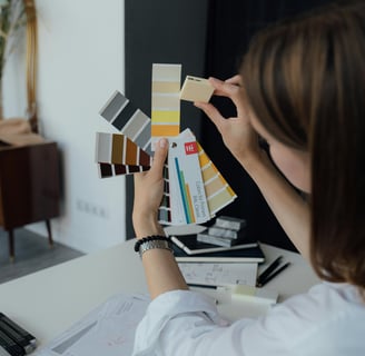
Use Color Swatches: Create swatches of your chosen colors to visualize how they work together. This can help you identify any adjustments needed before applying them to your artwork.
Consider the Context: Think about where your artwork will be displayed and how lighting conditions may affect color perception. Different lighting can change the appearance of colors significantly.
Trust Your Instincts: While understanding theory is essential, don’t hesitate to trust your instincts when it comes to color choices. Your unique voice as an artist is just as important as the technical aspects.
Conclusion
Mastering color theory is a crucial step in elevating your artistic skills and enhancing your creative expression. By understanding the color wheel, exploring various color harmonies, and recognizing the psychological impact of colors, you can make informed decisions that resonate with your audience. Whether you’re a beginner or looking to refine your skills, embracing the complexities of color will empower you to create dynamic and captivating artwork. So dive in, experiment, and let the colors guide your creative journey!
Creativity
Explore art, learn, and embrace your passion.
CONTACT US:
Expression
artandanomaly@gmail.com
© 2024. All rights reserved.
